Oni Central Forum
You are not logged in.
- Topics: Active | Unanswered
#151 02/04/11 21:02
- Samer
- Member

- From: Lebanon
- Registered: 09/04/09
- Website
Re: NEW CHARACTER: * Casey * =Version 6= updated on 24/04/2022
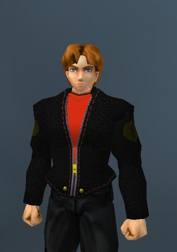
casey's last outfit ![]() (still in the making)
(still in the making)
Join our Oni Facebook Group
Check My YouTube Channel for my Oni Videos.
Check My Wiki page for all my stuff
Offline
#152 02/04/11 21:02
- Mukade
- Member
- From: Ottawa, Ontario - Canada
- Registered: 05/29/07
Re: NEW CHARACTER: * Casey * =Version 6= updated on 24/04/2022
Looks awesome, but I don't particularily like the shirt underneath ![]()
It's much too vibrant, try lowering the saturation a bit maybe?
"He looks mean enough to tear my arm off and beat me to death with it. In fact, he looks mean enough to tear his OWN arm off and beat me to death with it."
Offline
#153 02/04/11 21:02
- Lithium
- Member

- From: Colorado
- Registered: 10/17/08
Re: NEW CHARACTER: * Casey * =Version 6= updated on 24/04/2022
how bout making it similar to konoko's? Grayish or how about blue?
Looks nice ![]()
Oni IRC | Kumite! Kumite! Kumite!
Offline
#154 02/04/11 21:02
- Dirk Gently
- Member
- From: Boston, MA
- Registered: 06/12/09
- Website
Re: NEW CHARACTER: * Casey * =Version 6= updated on 24/04/2022
I think the texture (at least the fake bump-mapping) on the jacket looks terrible.
Offline
#155 02/04/11 22:02
- Samer
- Member
- From: Lebanon
- Registered: 09/04/09
- Website
Re: NEW CHARACTER: * Casey * =Version 6= updated on 24/04/2022
I think the texture (at least the fake bump-mapping) on the jacket looks terrible.
and i think u can be a bit more constructive in ur criticism ![]()
oxe since he already has a blue ourfit and a grey one ( tctf lite ) i thought of making something different, but also the blue sounds cool .. i might just make the same outfit but with blue undershirt ...
mukade mm yeah i see ur point :\ i'll try to tone it down a bit but it's still missing light effects shadows and such that's why it looks so bland.
Join our Oni Facebook Group
Check My YouTube Channel for my Oni Videos.
Check My Wiki page for all my stuff
Offline
#156 02/04/11 22:02
- Dirk Gently
- Member
- From: Boston, MA
- Registered: 06/12/09
- Website
Re: NEW CHARACTER: * Casey * =Version 6= updated on 24/04/2022
What do you want me to say, that is the wrong bump for that sort of a skin. It looks bad.
Offline
#157 02/04/11 22:02
- Samer
- Member
- From: Lebanon
- Registered: 09/04/09
- Website
Re: NEW CHARACTER: * Casey * =Version 6= updated on 24/04/2022
ok feel free to make the correct one after it's released.
Join our Oni Facebook Group
Check My YouTube Channel for my Oni Videos.
Check My Wiki page for all my stuff
Offline
#158 02/04/11 22:02
- Lithium
- Member
- From: Colorado
- Registered: 10/17/08
Re: NEW CHARACTER: * Casey * =Version 6= updated on 24/04/2022
Actually i'm kinda liking the red now
Oni IRC | Kumite! Kumite! Kumite!
Offline
#159 02/04/11 22:02
- Dirk Gently
- Member
- From: Boston, MA
- Registered: 06/12/09
- Website
Re: NEW CHARACTER: * Casey * =Version 6= updated on 24/04/2022
ok feel free to make the correct one after it's released.
mmmmmk.
Offline
#160 02/04/11 23:02
- EdT
- Moderator
- From: Los Angeles, CA
- Registered: 01/13/07
- Website
Re: NEW CHARACTER: * Casey * =Version 6= updated on 24/04/2022
Samer: You are really talented in character modeling and texture making.
I've done a little texturing with Motoko and Lara, so I know how hard it is for texture or UV mapping. Getting the textures to match the polygons is a lot of work.
Keep it up, you'll only get better!
Offline
#161 02/04/11 23:02
- Gumby
- Member
- From: Seattle, WA, USA
- Registered: 08/30/07
Re: NEW CHARACTER: * Casey * =Version 6= updated on 24/04/2022
I agree with Dirk, it seems a bit off. Maybe try making the bump size smaller? Which filter did you use to make it?
Iritscen: ![]()
Iritscen: it's amazing this program even works
Gumby: i know
Iritscen: and that statement applies to my code, not just yours
Offline
#162 02/04/11 23:02
- Dirk Gently
- Member
- From: Boston, MA
- Registered: 06/12/09
- Website
Re: NEW CHARACTER: * Casey * =Version 6= updated on 24/04/2022
tbh, right now it makes it look like a fleece jacket, dunno if that is what you are going for or not, I assumed it was a leather jacket or some sort of a blazer. Either way unless you were going for fleece, that is definitely the wrong fake bump.
Offline
#163 02/05/11 03:02
- Samer
- Member
- From: Lebanon
- Registered: 09/04/09
- Website
Re: NEW CHARACTER: * Casey * =Version 6= updated on 24/04/2022
I think the texture (at least the fake bump-mapping) on the jacket looks terrible.
... What do you want me to say, that is the wrong bump for that sort of a skin. It looks bad.
vs
tbh, right now it makes it look like a fleece jacket, dunno if that is what you are going for or not
see the second one is more constructive .. that wasn't too hard was it ^_^ ? it's little words that make all the difference .. example : tbh, I suggest, how about ... just calling it wrong and terrible isn't helpful .. mukade for example didn't like the color he suggested lowering the saturation .. oxe suggested other colors .. u just called it terrible without any alternative or explanation ...
I've done a little texturing with Motoko and Lara, so I know how hard it is for texture or UV mapping. Getting the textures to match the polygons is a lot of work.
it is very hard and I don't think anyone who hasn't textured something in Oni himself would realize how hard it is .. it took me a long time to just align the zipper on the chest and mid in such a way they look continuous ...
I am not a professional photoshoper or artist I started using photoshop when i started modding oni, I'm learning things as i go .. I'm not as good as Severed or Vicious Reilly in texturing and i don't claim to be, I'm doing what i can with the knowledge and experience and tools i have.
Gumby i'm glad u modified ur original post (got it on hotmail) ... to answer ur question I used sandstone effect i only have 4 filters and that's the only one that looked close enough.
about the size : some body parts are 512x512 some are 256x256 .. the smallest size of that filter is 50 ... so i used that on the 256 and used 100 on the 512 .. i can't use a smaller one cz say if i used the 50 which s the smallest on the 512 and on the 256 .. then the 256 would look stretched and pixelated in comparison to the 520..
anyway it's too late for me to change that effect now except if i start again from scratch which i'm not willing to do. i'll try to blur it a bit maybe.
Join our Oni Facebook Group
Check My YouTube Channel for my Oni Videos.
Check My Wiki page for all my stuff
Offline
#164 02/05/11 04:02
- Gumby
- Member
- From: Seattle, WA, USA
- Registered: 08/30/07
Re: NEW CHARACTER: * Casey * =Version 6= updated on 24/04/2022
Try Lowering contrast and then adjusting the brightness to taste.
Iritscen: ![]()
Iritscen: it's amazing this program even works
Gumby: i know
Iritscen: and that statement applies to my code, not just yours
Offline
#165 02/05/11 04:02
- Nitr0
- Member
- From: Croatia
- Registered: 11/26/10
Re: NEW CHARACTER: * Casey * =Version 6= updated on 24/04/2022
It look very nice ![]()
Samer, you are really good in texturing.

Offline
#166 02/05/11 05:02
- Samer
- Member
- From: Lebanon
- Registered: 09/04/09
- Website
Re: NEW CHARACTER: * Casey * =Version 6= updated on 24/04/2022
ok now i need some ideas :\ the back of the jacket looks very bland ... so I was thinking of adding something on it to make it interesting .. there's a dragon symbol on motoko's jacket ... so i liked the idea ..
i searched for the name Casey and it turns out it means brave, valiant ... so I thought a lion symbol would look nice .. ( bravery => lion ... casey's red hair => lion mane like ![]() ... his moves include lion axe kick and lion punch ) so the lion seems a good fit ...
... his moves include lion axe kick and lion punch ) so the lion seems a good fit ...
i got these 2 lion designs :
1-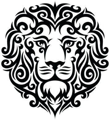 2-
2-
which one do u like more .. and how do u think i should apply it to the jacket ... vibrant color .. emboss like ...
there's also a little problem that the chest and mid are 2 different pieces ... if i want the design over the whole back i'll have to divide it between the chest and mid .. and during some moves it will look disconnected.
Last edited by Samer (02/05/11 05:02)
Join our Oni Facebook Group
Check My YouTube Channel for my Oni Videos.
Check My Wiki page for all my stuff
Offline
#167 02/05/11 07:02
- Nitr0
- Member
- From: Croatia
- Registered: 11/26/10
Re: NEW CHARACTER: * Casey * =Version 6= updated on 24/04/2022
I like the first one more, but the second one isn't bad and it's smaller. Maybe you could put second on just one body part...
Offline
#168 02/05/11 07:02
- Iritscen
- Moderator

- From: NC, USA
- Registered: 10/22/07
Re: NEW CHARACTER: * Casey * =Version 6= updated on 24/04/2022
The second lion would be good for an "extreme" kind of character, someone who is kind of fearsome. The first lion is one that says "justice" to me, and "valiant".
Check out the Anniversary Edition Seven at ae.oni2.net!
Offline
#169 02/05/11 10:02
- EdT
- Moderator
- From: Los Angeles, CA
- Registered: 01/13/07
- Website
Re: NEW CHARACTER: * Casey * =Version 6= updated on 24/04/2022
I like the first one too. I would suggest making it small enough to fit on the chest part
Offline
#170 02/05/11 15:02
- Lithium
- Member
- From: Colorado
- Registered: 10/17/08
Re: NEW CHARACTER: * Casey * =Version 6= updated on 24/04/2022
I like the second one, but the first one makes more sense
Oni IRC | Kumite! Kumite! Kumite!
Offline
#171 02/05/11 17:02
- Mukade
- Member
- From: Ottawa, Ontario - Canada
- Registered: 05/29/07
Re: NEW CHARACTER: * Casey * =Version 6= updated on 24/04/2022
If you're going to full on put it in the middle of his back or mid-chest, I'd say the first one, because of the symmetry. The second one is asymmetrical, so if you were going to put it off to one side, I'd say the second one is your best bet
"He looks mean enough to tear my arm off and beat me to death with it. In fact, he looks mean enough to tear his OWN arm off and beat me to death with it."
Offline
#172 02/05/11 17:02
- Lithium
- Member
- From: Colorado
- Registered: 10/17/08
Re: NEW CHARACTER: * Casey * =Version 6= updated on 24/04/2022
How's this one?
Oni IRC | Kumite! Kumite! Kumite!
Offline
#173 02/05/11 18:02
- Samer
- Member
- From: Lebanon
- Registered: 09/04/09
- Website
Re: NEW CHARACTER: * Casey * =Version 6= updated on 24/04/2022
oxe i tried urs .. it became very unclear when i resized it .. since it's a jpg .. wmf or png work best to maintain the image's clarity when resizing.
i agree with Iritscen, i chose the first one ![]()
thanks for ur feedback ..
now i want to ask abt the orignal outfits ... the blue one and the cop one ... the blue one i enhanced it and made several modifications ... i need ur opinion about the cop one 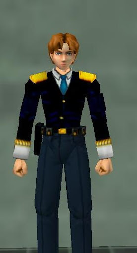
what suggestions do u have to make it look better .. obviously the pixelation should be fixed and given cleaner edges ... i also think it would look better if the pants and top were one color ... i think the pants color .. what do u guys think ![]() ?
?
Join our Oni Facebook Group
Check My YouTube Channel for my Oni Videos.
Check My Wiki page for all my stuff
Offline
#174 02/05/11 18:02
- Lithium
- Member
- From: Colorado
- Registered: 10/17/08
Re: NEW CHARACTER: * Casey * =Version 6= updated on 24/04/2022
Yeah i think make the shirt similar to pants' color
Oni IRC | Kumite! Kumite! Kumite!
Offline
#175 02/07/11 06:02
- Samer
- Member
- From: Lebanon
- Registered: 09/04/09
- Website
Re: NEW CHARACTER: * Casey * =Version 6= updated on 24/04/2022
Version 3 Released on 7/2/2011
Change Log and download link in the first post.
Join our Oni Facebook Group
Check My YouTube Channel for my Oni Videos.
Check My Wiki page for all my stuff
Offline